Hey world, can we give Hillary Clinton a break?
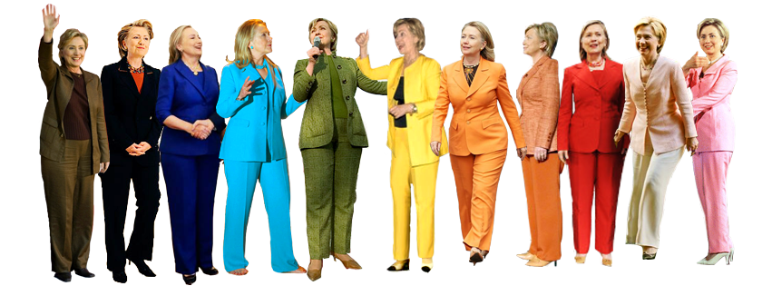
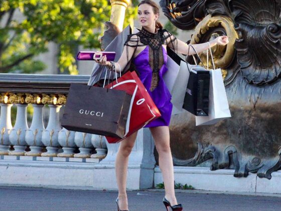
Despite fighting for women’s rights across the globe, governing the fourth most populous U.S. state and defending the Free World as Secretary of State, Clinton’s public image — namely, her penchant for the pant suit — has stalked the former First Lady for years. She’s been described as a “man-repeller,” criticized for not wearing enough make-up, and, possibly the worst critique, had her body image publicly dissected in the aftermath of the 1998 Monica Lewinsky scandal.
ADVERTISEMENT |
Thankfully, Clinton has lashed back. She’s called out journalists for asking about her favourite designers (“Would you ever ask a man that question?”) and joked that, if she wants to make the front page, she just needs to change her hair.
In one particularly illuminating statement, Clinton described what it’s like to be a woman under the media’s microscope: “If a woman wants to succeed in the public arena, she needs to grow skin as thick as the hide of a rhinoceros. I have certainly, as you can tell, have had to learn how to do that, and there’s a lot of good moisturizers I can tell you about if you’re interested. The second thing is to learn how to take criticism seriously but not personally.”
So things are settled, right? We can look past a female politician’s image and wade into some more pressing issues — say, the widening U.S. wage gap or the recent police violence targeting young African American men? The economy? Gun regulation? How our planet is literally becoming less liveable by the day?
Nope. Hold your horses, we’re not quite there yet. Let’s discuss Hillary Clinton’s campaign logo.
ADVERTISEMENT |
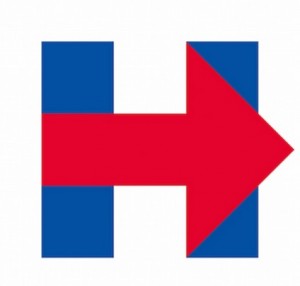
You’ve probably seen it by now. And yes, it’s not thrilling: a blue “H” with a red arrow through its Democratic heart. What could it possibly mean?
Within minutes of the logo’s launch in April, online speculation was aflutter. Design critics said the logo was amateur and simple-minded. Republicans wondered why the colour red, obviously private property of the GOP, was splashed across their opponent’s ads. On Twitter, the joke-du-jour was that Clinton made it herself on Microsoft Paint. Easily the lowest blow was a comparison to 9/11, the stems of the “H” symbolizing the Twin Towers.
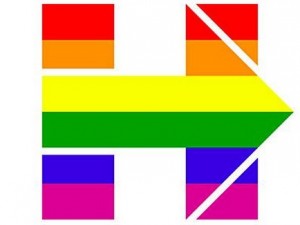
As is her style, Clinton heard her haters and parlayed with a pejorative kick in the face. On April 28, she made her logo rainbow to support marriage rights of same-sex couples, an issue currently before the Supreme Court.
ADVERTISEMENT |
“Every loving couple & family deserves to be recognized & treated equally under the law across our nation. #LoveMustWin #LoveCantWait,” Clinton tweeted April 28.
It’s expected that Clinton will continue to use her logo as a barometer for social and political issues that she wants to bring to light, sort of like the CN Tower on Christmas. Change your hair and you’ll make the front page, right?
Yet one question lingers — why was it that Clinton’s logo was picked apart, and not those of her (mostly male) opponents? We think we know the answer. But, for the sake of equality, we’ve ranked the logos of the other presidential hopefuls. Because, fairness.
ADVERTISEMENT |
JEB BUSH
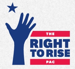
George Dubya’s baby brother may be running for president, but his graphic design game needs some serious work. A right hand reaching for a star — what could it possibly mean? Maybe Jeb suffers from a Napolean complex, or he just really wants to go to outer space. Don’t fret if you don’t win the nomination, little Bush; if you shoot for the stars, at least you’ll land on the moon (or something like that).
TED CRUZ
ADVERTISEMENT |
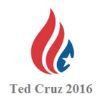
As Alicia Keys would say, this logo’s on fire. Or is that a teardrop? A secret endorsement of Canadian Blood Services?
ADVERTISEMENT |
Or does he read a lot of Onion articles?
Judging on his policy stances, the latter makes the most sense.
ADVERTISEMENT |
BERNIE SANDERS
Aside from having the absolute cutest logo of all time, Bernie Sanders is breaking the secret rule of male candidates by branding with his first name. (I guess “Barrack,” “Bill” and “George” didn’t have the same ring?)
And if he doesn’t win, he could consider starring in the latest Annie spinoff.
ADVERTISEMENT |
RAND PAUL
ADVERTISEMENT |
Swipe right for Rand? The Kentucky senator most definitely stole his logo off Tinder. Speaking of branding, was there a real need to shorten “Randal”? It’s supes annoy.
MARCO RUBIO
ADVERTISEMENT |
I usually dot my i’s with hearts, but maybe I’ll start practicing with little maps of America. But while Marco’s geography game might be en pointe, he should probably reconsider “A New American Century.” That was, like, 15 years ago.
MIKE HUCKABEE
ADVERTISEMENT |
“From Hope to Higher Ground” — is there a flood coming? Is this commentary on the melting polar ice caps? Has he even read about California’s water levels?
CARLY FIORINA
ADVERTISEMENT |
The former CEO of Hewlett-Packard (and the first woman to lead a Fortune 50 business) has gone with a distinctively sans serif digital font, which is kind of neat. But that little red star is a little cliché.
What are your thoughts on the presidential hopefuls’ logos? Share your comments below or tweet us at @ViewtheVibe.


